Watchwork
Paste a YouTube link. Get the key takeaways and a ready-to-paste prompt that tells your coding agent how to apply them to your own codebase.
Works with any public video. Takeaways, transcript and developer prompt are generated in one pass — a 10 minute video usually lands in under a minute.
Key takeaways
The concepts and lessons worth keeping, without the waffle.
Developer prompt
Paste into your AI IDE of choice — it reviews your repo and plans only the changes that genuinely fit.
Full transcript
Kept alongside, for when you need the exact wording.
Video library

Okay, we're going to launch here. So, my name is Frank Coyle. I'm an educator. I'm teaching at Berkeley now. I've been doing this computer science stuff for, oh, 30, 35 years. And, um, I'm and right now, it's kind of a critical time for computer science students. It used to be the used to be the only game in town. Degree was a guaranteed job, and now, thanks to AI, it's not. But then again, 5,000 people are here. So, AI and and agents are, um, seem to be the way to go. So, the question is, how do we leverage this new universe that we are moving quickly into? And so, I want to talk about how agents and ontologies, a big word, fit together. But before you before I do that, I wanted to, um, I wanted to give you my, uh, my educational philosophy. And this comes from someone called Sister Corita Kent, and it was made popular by John Cage, who is a, uh, an avant-garde musician. And you got to think about this a little bit. Nothing is a mistake. There's no win and no fail. There's only make. And more and more today, that's what's important. Get down and make stuff, and that's how you're going to learn, not by necessarily reading. I'm also a big fan of writing. My early career was in neuroscience. I'm kind of coming back into it now that agentic AI is bringing, uh, kind of cognitive science back. But engage your senses. Get a notebook, get a pen, a pencil, draw pictures, write stuff down. Just don't type, because when you're typing your brain is thinking about the letters on the keyboard. When you're writing in a book, your whole brain, your your whole all your sensory systems are engaged, and you're going to learn faster that way. Okay. Onto our talk. Agents and ontology. So, there are two lineages here that I want to talk about both, give you a little philosophical background. Um, agents. When did we start talking about agents? It well, goes goes back to the early initial days of AI. People like John McCarthy, uh, uh, uh, Selfridge, Marvin Minsky, Society of Mind, people started thinking about the fact that this new computing technology was going to lead us into some kind of artificial intelligence, which is a term that came in 1956 when all these characters got together and tried to figure out where the future was going. Okay? And the concept of an agent finally evolved, things that perceive and decide and then act. And that's what we're seeing now. Now, what about ontologies? Well, it turns out ontologies are not that new. Okay? It was actually Aristotle who first came up with the concept of we need a philosophy of of being. Like, whoa, kind of heavy. Um, but came up with categories of being. And this kind of relates to what people are doing now with graph databases and knowledge representation. And there are a couple of other people who kind of formalized it. Uh, Quine was a philosopher, and then this guy Gruber, 1993. And I think this captures what knowledge and, uh, graph technology really represents. It is a a formal specification of a shared conceptualization. And that's what we want to give to our agents. We want to give them our conceptual our conceptualization of the universe, our domains. Okay? And now, what's happening is you're getting the convergence of something that is probabilistic, the agents, the LLMs, with the the more formal representations that you have with ontologies. And so, this term is now being used. You're hearing this a lot: Neurosymbolic AI. Sounds pretty fancy, but it's really neural networks tied into symbolic AI, which rule-based systems come under that category. Um, as do the knowledge graphs that we're that we're assembling. And so, what I'd like to argue is that Neurosymbolic AI sort of represents a way to keep the LLM on its guardrails because LLMs are by nature probabilistic. People worry about hallucinations, but that's the feature. That's actually a feature of large language models. It's who we are. We hallucinate in a way. We imagine things that may not exist, and then we turn them into reality. And that's what large language models do in in a way. Okay? So, let's just quickly overview what ontologies are. It's not they're not complicated. They're basically our representation of entities and their relationships to other entities. And these entities have properties. And this whole concept of graph databases arose when people began to realize that relational databases sticking data into tables was too restrictive. You wanted to add something new to a relational database, you had to add a new column. Man, then you had to redo the whole structure. With with a graph database, you can just attach another item. You can just attach a property. You can attach a relationship. Okay? So, the question often arises, okay, I I get it. I need to have an ontology to represent in a formal way what my organization is doing, how do I do it? Okay? There are a couple of ways you can approach it. You can have a top-down approach or a bottom-up approach. Top-down approach is you get the experts together, and they sit down and analyze the domain, come up with the entities. What do we have? We have purchase orders, we have customers, we have customer representatives, and we're going to structure them, they have properties, these are the relationships. Okay, that's one way. And this models what we were doing back in the '80s when I was involved in expert systems. Everybody thought expert systems was the way to do AI. Symbolic AI was the way to go. Companies rose, millions of dollars was spent. The the Japanese created this, uh, future world project in the late '80s. People in America were my my son was taking Japanese in school because of these expert systems. And, but they couldn't scale. They couldn't scale, and then we went into a kind of an AI winter. Where did neural networks came come from? Neural networks were put out there in the '60s. But they couldn't scale because we didn't happen to have NVIDIA who was off making GPUs to make make reality of the of the video games fantastic. And then someone said, let's turn these things over to the neural networks. And, of course, that's kind of why we're here now. So, the other way you can that that people are adding to or creating ontologies is is from the bottom up. For example, customer reactions. What are the things the customers are involved in? Hey, the you these entities, these relationships, let's add this to our ontology. Let's let's add this information to the graph. Now, as as a help, it's helpful to be aware that there are existing taxonomies that people have been working on for the last 15 to 20 years. Things like Schema.org, which has a whole set of terms and relationships. So, you don't have to reinvent the wheel. In fact, it it's to your advantage to use some of these ontologies. FOAF, a friend of a friend for modeling social networks. The Dublin Core, which was an early an early attempt to come up with terms for describing, uh, research papers and books and so forth. So, there's a whole series of things. In fact, Wikipedia is based on an ontology called DBPedia. So, when you do a search on Wikipedia, it's looking things up in its giant graph database. So, this stuff has been out there underlying a lot of what we already do. So, take advantage of these things that already exist. Okay. Now, what do you do when you build your ontology? Okay, so what? I know what these entities are. I know what their relationships are. They have properties. How can I do anything with them? Well, there are other augmenting technologies, auxiliary technologies. Things they call things like RDFS, which is a technology, and OWL, which I'll talk more about. So, these have these kind of sit over to the side of your graph. Okay? And you have the entities and relationships, but you want to apply some control over them or you want to be able to make inference over them. So, for example, there is, uh, some terms in this technology called RDFS. Domain and range. So, if I say, "teaches" has a domain of teacher, that means if I say, "Bob teaches Scooter" in my text, I can infer that Bob is a teacher. And if I say, "all teachers are persons," then this statement lets me know if I say, "Bob teaches Scooter." Now, I know Bob is a person. Bob is a teacher. What about Scooter? If I say, "teaches" has a range of student, that means the the right side of the verb, then Scooter is a student. And now, I have this extra information into my system. So, that's very useful. Then there's some properties called functional properties, which means only one. So, has father is a functional property. You can only have one father. You can only have one mother. That is a functional property. Okay? So, that's that can serve as a constraint. So, when if you say, "Bob is my Bob is Jim's father. Bibbi is Jim's father." Well, the inference here is that Bob and Bibbi are two ways of representing the same individual because that is a functional property. You can only have one. So, these derivations and constraints don't sit in the graph. They sit sort of on the side, and they can help. As we're going to see, I'm going to propose, when we deal with agents, how can how they can help us out. So, what about agents? Everybody's talking about agents now, and everybody's talking about loops. Loops, loops, loops everywhere. Loops have been around for a long time. Back in the '60s, people were debating, "Who has the best programming language? Fortran or COBOL? No, mine is better. No, mine is better. Oh, you don't know anything. You don't know what you're talking about." Boehm and Jacopini, 1966, came out and said, okay, there is no real difference in programming languages if they have three aspects: sequence. I can put statement A, statement B, statement C. Fine. I have conditionals, I can have if then. And the last piece, I have a loop. If I have a loop, if I have iteration, if I take these three things, the language is what's called Turing complete. Can do any can compute anything that can be computed by computational devices from the work of Alan Turing. Okay? And now, we're seeing this in agentic AI. Agents are now have loops. Loops give us the last piece in the equation of giving us a technology that is capable of doing anything that computational devices can do. The danger, though, of loops is that they can break. If you're if you're a programmer, you know, you've all go into infinite loop. Not good. Loops can drift as agents start talking to each other, things get all go off off the rails. And loops can cost you money. Token counts crank up as the loops continue. So, you don't you need to be careful. Okay? But in a way, we are revisiting some of the early stuff with symbolic AI. I would argue we're going back to the world of expert systems, which is the symbolic part of the whole thing. So, I want to show you a little example using Claude agent. So, little code here. Don't get scared. But I know nobody does Python anymore, but you got to look at what the agent's giving you, and you got to you got to move in and and manipulate it. So, here's a here's a loop. While true, classic Python loop. Okay? And so, we have a client. So, we're actually so the first little chunk here that you see RSP. This is just some code where we have a model, and we have, uh, we have a prompt, that's part of part of the messages, and we have a tool, and we're we're asking the LLM to solve this problem using a tool. Now, here's the here's the catch. LLMs can't do anything. All they can do is give us the next word with a high probability. Amazingly, we can now have these conversations with it. But they can't do anything. But we can give it a tool, and we can give it what we want and say, "How do you think this tool can help us get what we want?" And then the LLM will set up the parameters and come back to us and say, "Okay, here's my response. I can't execute this tool, but I know what the input parameters are. I know what your context is. I know what your prompt is. So, here is the call that you need to make of the tool, because I can't do it. I'm the LLM. I'm just locked in this box. Okay? So, the second box, the second chunk is stop reason. So, stop reason means the LLM has stopped for some reason. The reason here is that it can't do anything. And if the reason is tool use, ah, now it's time, let's go execute that tool. So, that second line, get tool. It takes the response, which is formulating the the parameters and triggering the action. Okay, now, there's stuff in red here. This is where I think the LLMs and other, uh, I'm sorry, not LLMs. The ontologies and stuff can come in. So, if you look down there, after the the tool is called, it said, "tool runs." This is where ontologies could come in. The tool is going to give us information. We put the information in a form that our our our validator can use. And think about the validator as operating with this these ontologies about our domain, then we can make some sense of whether the response of the LLM is reasonable. So, this is the loop: Call a tool, check the stop reason. If it's a reasonable result, then let's go with it. If it's not reasonable, go back to the LLM. Say, "Oh, this is this is not working." Or get a human in the loop. But the idea is to surround the input with checks. Now, I've got this something that you that you should be at least taking a look at if you're doing some of this coding is something called Pydantic. Pydantic is a way to specify the types of what you want the types of the parameters to be. Those of you who who do know Python know Python is a unstructured type language. So, you can have a variable X = 20, X = "hello," no problem. There's no typing. Pydantic adds typing to that. So, you want to check your types with Pydantic, and then check your results with the ontology. Okay. I've only got another I've I've got a I've got a I've just a short time. I'm going to try to show you some of the things that, um, that you can some logical constructs from from something called OWL. The the, uh, the web object language for for objects. So, you have these functional properties, disjoint properties. I'll just put these you can look at the slides, but essentially, the errors it can catch, looking over in the the right-hand column, a second refund on the same order is a is a problem. Ontologies can catch it, whereas it's it's very tricky to do that in in English. A payout sent to the support desk instead of the buyer. Okay? You can catch that with an OWL disjoint property where customer and support rep are two separate entities. Okay? Uh, one of A made up value like "probably shipped," no tool can read. You can specify, you must have certain kinds of values. So, uh, the status: paid, shipped, or refunded. Nothing else. And when you're in the pure text world, this can get this can get funky because the the LLMs are again probabilistic and, um, return some crazy stuff. Okay. Uh, so, really what the point I want to make here is use these read you can have a reasoner built on ontology to check, keep the LLM on track, have guardrails to keep it honest. Okay? And my my bottom line is nothing is a mistake. There's no win, no fail. Only make. Okay? Feel free to reach out to me, coyle@berkeley. I've got a I've got a I've got a little website, codesupreme.ai. I'm a big fan of if you're John Coltrane has a has a some jazz called, uh, called Love Supreme. So, I've named my site code supreme, and if you go there, I've got some music, and it's all good. Okay, thanks very much. It's 20 minutes.
13 Aug, 07:18

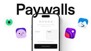
After studying nearly 3,000 paywalls, hundreds of subscription flows on Mobbin, and talking to someone who's designed over 4,700 paywalls, we found this. Sometimes an ugly paywall could outperform a beautiful one. No matter what I did, the ugly paywall with a ton of text completely over-performed anything that I would do. More friction could increase conversions. Multi-page paywalls almost always do better than single-page paywalls. Every paywall today kind of looks the same, so I wanted to know what separates a high-performing paywall from an average one. When do users decide to subscribe? I used to think the decision happens on a paywall, but actually, users sometimes decide to pay before they even see the paywall. All the different touch points are extremely important. The paywall can appear after onboarding, when you unlock a premium feature, inside settings, or even as a win-back offer before you leave. Those paywalls speak more to the user because they're more personalized. You're constantly trying to get the user to either pay or stay as a subscribing member, and so you have to think about the entire lifecycle of the customer. And yes, product is important for being able to solve a problem. But lifecycle, monetization, and the paywalls, that's the only part of the app that makes money. A paywall isn't just a screen. It's a flow. Before asking for money, Opal spends time selling the outcome: getting eight years of your life back. By the time you reach the paywall, it doesn't feel like an interruption. By showing users how many years of their life they could save, trial signups went up from 7% to 17%. Jonathan prefers multi-page paywalls. Multi-page paywalls almost always do better than single-page paywalls. And so, in this paywall, you're at the end of the customer journey and onboarding. And you just showed the customer that, hey, your plan is ready. This is what you can expect. You're speaking to them from an emotional perspective. You're telling them they're going to start feeling like themselves in four weeks, or you're going to tell them something that is in line with their actual ideal outcome. So the paywall already feel part of the experience, like if it's an onboarding. Is it a natural segue to kind of finish the onboarding? Ahead takes a similar approach. Information unfolds gradually. It gives users time to process the decision instead of forcing them to absorb everything at once. I think when a paywall works, it doesn't feel like you've hit a wall. It feels like the product is asking you to take the natural next step. Timing matters more than design. Even if you have a well-designed paywall, if it appears at the wrong moment, it's still a bad paywall. One example is the one-time offer. If you close it, it's gone. Paired with animation and haptic feedback, this helps to pull the attention of the user the moment that you're considering an upgrade. Even when the timing is right, people can still hesitate. Will I forget to cancel? Am I making the right decision? And that's why some of the best-performing paywalls focus on reducing risk. Reducing risk beats persuasion. Blinkist had a problem. Their users complained about free trials because they felt tricked into being charged. So, they redesigned the paywall screen to show a step-by-step timeline. The result was more trial sign-ups, fewer complaints. Push notification opt-ins also went up. Which makes sense because they remind you before your trial ends. Tipstop emphasized the free trial, added a discount badge, and made the offer easier to understand. The offer didn't change. The way it was presented did. Direct conversions almost tripled. And then there's Slopes. Instead of redesigning the paywall, they asked a different question. What if we got rid of the paywall altogether? They took inspiration from Apple's redeem free trial approach and built what they call a payramp. Users see a single action: redeem your free week. No traditional paywall standing in the way. This alone increased trial starts by 25%. Which brings us to one of Jonathan's favorite paywall tweaks. This no commitment, cancel anytime subtitle always seems to do well, adding it to the paywall will bump things up incrementally. And then also having some kind of call to action for what the user is doing instead of just continue is hit or miss, but I do like to experiment with that as well. Another thing, too, is like having this right chevron here on the button. I can't make a judgment yet as to whether like this in itself does the best because I have not done a test yet where everything is the same, except for this right chevron, but in most of the paywalls that end up winning, they have this right chevron. So I've also started to include it on the button along with this subtitle here. Jonathan takes this idea one step further. So, if they try to hit cancel over here, I like to show the users an exit intent sheet. If they're not ready to commit for a year, you can still subscribe to the monthly plan. And when we talked about aggressive last-minute discounts, I wouldn't really do this unless it's maybe Cyber Monday, Black Friday. I'm really curious to see how Apple is going to approach that this year for all these different sales. But to make sure that I'm compliant and safe, I'd recommend instead to have an offer with a larger trial. Giving users a longer trial could help you achieve the same goal while preserving trust. So, if reducing risk helps with conversions, we would expect that removing friction would do the same. But that's not the case. More friction can increase conversions. To start your free trial on Outseta, you need to enter your credit card details. Signups dropped by more than half, but the conversion rates increased by five times, more than double the paying customers. The extra friction filtered out people who were never serious in the first place. Moonly discovered something similar. They introduced a free trial, but only on the annual plan. +39% Subscription Conversion, +47% Revenue per 100 installs, +5% ARPPU Average revenue per paying user. Sometimes what changes isn't the offer, it's how the offer is framed. One of the most common techniques is social proof, with real user reviews and a five-star rating. These social accolades are really nice to kind of show credibility and authority. The second common technique is value framing. You're framing the value in such a way that it matches what the users care about. All these screens are selling different futures. And then there's price anchoring. Tide breaks down the price into smaller weekly amounts. Ahead compares its subscription to things people already spend money on, like coffee or therapy. Next up, pricing and packaging. Headspace tested 7-day, 14-day and 30-day free trials. The winning variant was this: 14-day trial for the annual plan. Even though the annual plan costs more, the longer trial made the whole decision feel less risky. If you're wondering what the best pricing structure is, it depends on what you're optimizing for. Ideally, you want to default to a yearly product because we see that that has the highest LTV. But a yearly product may not be the best for your business. If you need to, you have that yearly product with a weekly or with a monthly product, you only want to show two to decrease cognitive load on the user. So, if you do want to support other pricing options, you always hide it behind a view all plans button that opens up a sheet with all the different pricing. You want to keep the base paywall simple. Get a bunch of users in there to see how your base stats perform before you go crazy on optimizing all your different placements. Jonathan is also a big believer in table-based paywalls. I am a huge fan of tables. They're a little harder to build in Superwall. I think that's maybe why, like in revenue cat and Superwall, I'm not really seeing a lot of tables. These also do a good job of showcasing what you're missing out on if you don't subscribe. This also works pretty well. A video paywall showing you the app in action and a simple bullet list, simple social proof here of people already using your app. Video could communicate value faster than static screenshots or bullet points. Now, one thing we kept coming back to was polish. I think animations work really well. There's an app that I really like right now that's going viral, it's called Focustown, and they've done an amazing job of branding and creating an Animal Crossing-esque experience. And that's the level of polish that we're going to be seeing from the most successful apps moving forward. You know, the bar has just been raised because now that anyone can ship an app, the ones that really put in the time to polish it with animations, with custom character designs, with world building are going to be the most successful moving forward. When two products are competing for the same user, polish could be the reason why someone chooses your product over the others. Introducing Mobbin MCP. If you're building with AI, that's exactly what Mobbin MCP is for. It gives tools like Claude, ChatGPT and Cursor access to Mobbin's library. So, instead of making things up, your AI can reference patterns that already exist in the real world. Compare how apps design their paywalls and pull examples directly into your workflow. Over 600,000 shipped screens. Now inside Claude. Now inside Cursor. Now inside Antigravity. Now inside ChatGPT. And many more. Think of it as grounding your AI's output in what's already been shipped. Not every pattern is worth copying. Some of the highest converting paywalls are the ones Jonathan is the most skeptical of. The same tactics you'll find in drop shipping stores and e-commerce websites. So, one paywall that works extremely well that I really have a hard time accepting is the spin the wheel paywall. This is a predetermined spin the wheel Lottie file that may land on some kind of discounted percentage. You know, the user gets to claim it, and then because they've just won something, the idea is that they'll be more likely to then subscribe at that price point. If you're optimizing for a longer-term business, that may not be a good paywall for you. But if you're optimizing for a weekly price and you want to maximize revenue, unfortunately, it works. The issue is that everyone is also starting to use it, or I'm seeing it used a lot more. When every app uses fake urgency tactics, users eventually stop believing it. I think more and more users are getting comfortable closing paywalls because they know they're going to get some kind of offer afterwards. And in early 2026, Apple also started rejecting paywall patterns that relied on free trial toggles because some of these were considered confusing or misleading. Just remember that this is a long-term game. Jonathan once worked with an AI girlfriend app. They had probably the ugliest paywall I've ever seen, and it was really compact elements, very aggressive squeeze page kind of paywall. So that ended up over-performing pretty much any paywall that I tried to do. Which means that there is literally no universal best paywall. Only better experiments. One thing that I learned from Jake and Nick at Superwall was that design tests move the needle the most. We ended up running radically different designs until you find something that blows everything out of the water. You could have a video paywall, you could have bullet list paywall, a trial timeline paywall, a long-form paywall. Test every copy, the pricing, the flow until something clearly wins. Getting people to subscribe is one thing. Building something that people continuously pay for is much harder. The metrics that I wish more founders really cared the most about is retention and LTV. I think if retention and LTV are good, you're building a good product, and you want to build good products so that the ecosystem is flourishing in itself. So, maybe the question isn't, how do I get people to pay? It's more of, how do I create something worth paying for? Fun fact. It takes less than five screens to subscribe to ClassPass, but 17 screens to cancel. Let us know if you'd like us to dive into cancellation flows or anything else in the comments below. Next, watch our breakdown on onboarding flows, dashboard designs, and the psychology behind streaks. I'll see you there.
12 Aug, 15:46

I've studied over a thousand onboarding flows to find out what makes good onboarding. And do we even need one? A lot of what I've read says, "keep it short." But, based on what I've found, the average app has 25 onboarding screens. The longest categories are finance, health and fitness, and education. Seven out of ten of these longest apps are actually finance apps as well. Some of the apps with the longest onboarding flows are also one of the most successful ones. When we look at apps with the shortest onboarding flows, three of them are AI products. So, maybe keeping our onboarding flow short was never the point. The best onboarding seemed to follow this pattern. You sign up, you set up your account, you hit the aha moment. That's where you actually feel the product's value. For Airbnb, it's making your first booking. For Netflix, it's finding and watching a show. For Mobbin, it's finding a screen or an animation that you love and saving it to your collection. So, what are these apps actually doing? The best onboarding screens I've kept seeing had one thing in common: they're not listing features, they're selling the outcome. Tiimo does this really simply. Their welcome screen is just showing the product in action on both their mobile app and desktop. Runbuds does this with animation. The moment you open the app, you get a feel for what it does without reading a single word. And Alma goes one step further. It lets you try the core experience before you sign up. I rarely see apps with AI features who let you try it out before signing up an account. And sometimes it could just be a copy tweak like Superhuman. They turn a boring sign-up screen into a pitch with logos on the side as social proof. Some apps skip the pitch entirely and just feel human. This is an app called One Year. So, in their onboarding flow, they included a founder's note which had a handwritten signature and a handwritten flower in it. Pretty cute. And Tinder acknowledge when your birthday is around the corner. Airbnb, well this one's not even in the onboarding flow, but when you successfully list your first space, they show you a video from their CEO. It's a founder's touch at the aha moment. As for Basecamp, they put a personal note from the CEO after you've created an account. It feels like the product was made with intention. One of the best onboarding flows add personalization into the flow and they make it worth your time. 23% of apps personalize during onboarding. With AI apps at only 7%. It seems like AI tools don't ask questions about your users up front. They let the product learn from us instead. Looking at Tide's onboarding, it's short and sweet. You just download the app, answer two questions, watch it customize your recommendations, and it'll prompt you to sign up. That's it, very simple. Headspace found out that their users come to their app with more than one pain point to solve. So, instead of asking users to pick just one goal that they want to achieve with Headspace, they let them pick more than one. It's almost like a very simple tweak, but it led to 10% increase in free trial conversion. There are also other apps that allow multi-intent queries. FocusFlight lets you choose your map style during onboarding. It makes the app feel like yours before you even started using it. Sometimes it can be even simpler than that. Dollar Shave Club tweaked the quiz copy to be more conversational. This alone led to 5% increase in subscriptions. Some apps don't just collect answers during the quiz. They actually show you what those answers unlocked. So, in Endel's onboarding, you answer six questions, and then they show you this. You haven't even used the product, but it already feels like it's going to work. Bitepal does the same thing. After the quiz, they build your personal plan and then tell you exactly when you'll hit your goal. Brilliant shows you courses that are personalized to your responses. As soon as you finish your onboarding flow, your homepage is already populated with only the content that you want to see. Here's another one by Speak, a language learning app. It asks you what language you like to learn and your goals. Then in one simple screen, it tells you, "In two months, you'll be able to communicate while traveling in France." There's a simple graph showing that speaking helps you reach your goals faster than reading. The steps before this screen already had you speaking instead of typing. So, out of 900+ apps and websites, 22% of them shows a paywall during onboarding. Some apps also pair personalization with a paywall. Beside pairs a quiz with a one-time offer to drive urgency. Tiimo does the same with a full page of social proof before showing the paywall. And FocusFlight makes the paywall itself fun. The one-time offer, it's shaped like a flight ticket and your phone vibrates as it gets printed out. It's a paywall that actually feels delightful. As for Grammarly, based on your quiz answers, they recommend tailored pricing plans. This alone led to almost a 20% increase in plan upgrades. Okay, some of these onboarding flows are really long. Yet, they don't feel like it. The onboarding flows that I really love tend to make onboarding flows feel short. Out of 986 apps, Duolingo has one of the longest onboarding flows. And if we zoom in, it goes like this: you get started, choose the language that you want to learn, it learns about you, you start your first lesson, get the satisfaction of completing it, and then you create an account. By that point, you've already gone through 60 screens before you even sign up. And the crazy part is, it doesn't even feel long. Okay, so Bump's onboarding flow is creative. Even the loading states are wild. There's always something going on throughout the onboarding flow. Smooth animations on things like verification that rarely get special treatment. It adds fun, it doesn't feel like you're going through a boring onboarding flow. Bitepal has 61 screens. The onboarding was a lot of fun. It has really amazing animations, the raccoon is quite lovable. You even get to name your virtual pet raccoon. Throughout the onboarding, they emphasize the value like, "Your personal plan is ready and you'll lose weight by an exact date." And then, bam, a paywall. Alright, so another pattern I noticed: some apps don't front load all the education to you. Cake Equity is a great example. They're dealing with dry concepts like company equity and vesting schedules. And turns it into something approachable with copy that reassures users from time to time and tool tips that explain the impact of each step so that users feel like someone's guiding them along the way. Even something as small as a password field that checks off requirements in real time as you type, removes a reason to get stuck. Maybe it's a progress indicator, maybe it's micro copy. None of this is flashy, but it makes the experience feel effortless. To-do apps does this really well too. Instead of giving users a blank, empty state, they show you something like this with no guided tours, no pop-ups, just a little nudge in the right place. And when Mural replaced pop-ups and banners with a clear six-step checklist, it drove a 10% relative increase in one-week retention. Checklists stick around even after the user dismisses the initial flow. If you go on Mobbin and do an AI search for onboarding checklist, you will find more ideas like this. Another pattern that I kept seeing is a lot of apps show a custom screen before the notification pop-up. Apparently, it improves accept rates significantly. Here's an example by Brilliant. "I'll remind you to learn so it becomes a long-term habit." Cool. Centr takes it one step further. It also teases you the notification that you will receive if you allow it. This might explain why web onboarding is 21% shorter than iOS on average. Mobile just has more permission and paywall screens baked in. Okay, this one surprised me. Houzz split their sign-up form into multiple screens. And they see a 15% increase in conversions. Maybe the friction we add in one place removes friction in another. Culture plays a role here as well. Users in Eastern markets tend to be more comfortable with information-heavy interfaces. So, what feels like clutter to one audience feels efficient to another. Which is partly why we can't just copy what worked. And I don't think there's one right or wrong way to design an onboarding flow that's best in class. The ones that stuck with me didn't feel like onboarding. What I saw in common in these apps is that they brought users to value quickly. Sometimes it's adding delight to a very long onboarding flow. Sometimes it's letting users personalize their app experience for themselves, and sometimes it's getting out of the way. So, do we even need an onboarding? Mobbin is a place to find design inspiration. The product speaks for itself. Same with AI chat apps. The first prompt is where users find value. For products like these, maybe the best experience is just to let users get in fast and not have an onboarding experience that gets in their way. Maybe it all boils down to the product. We had so much fun diving into the data. And did you know that onboarding flows are the second most searched on Mobbin? For the next video, I have a feeling that we're going to dive really deep into dashboards and see what the data tells us. So, stick around, subscribe if this vibes with you.
12 Aug, 15:05